

Wicklow Hills
Arts Collective
Wicklow Hills Arts Collective brings together artists, makers and writers from across West Wicklow, creating opportunities for connection, collaboration and shared creative experiences.
The challenge was to develop an identity that reflected the diversity of its members while feeling contemporary, recognisable and rooted in the landscape and community that brings them together.
Brand Identity / Creative Direction / Brand Guidelines


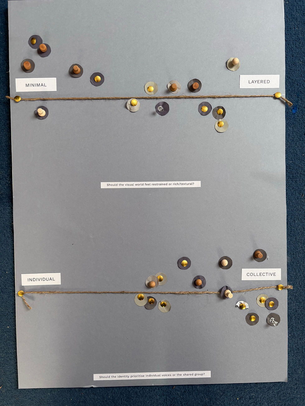
The process began with a collaborative workshop, bringing members together to explore their shared values, ambitions and what makes the collective unique.
From these conversations, I developed a series of creative approaches, gathering feedback and refining the direction together.
The final identity takes inspiration from the view through the windows of the community hall where the collective gathers. A simple frame references the surrounding Wicklow Hills while creating a space for the work of its members to take centre stage.


One identity, many voices
Every artist works differently, and every exhibition tells a different story.
Rather than imposing one visual style, the identity provides a consistent framework that allows the collective's many creative voices to shine.
The brandmark becomes a window into the collective, framing the work, people and places that make it unique. The frame stays the same, while what it reveals is always changing.


Inspired by the colours and textures of the Wicklow landscape, the visual identity combines expressive typography, a versatile colour palette and natural photography.
Matimo brings character and personality, while Instrument Sans provides a clean, contemporary balance. Together with tactile textures and generous space, these elements create a flexible visual language that allows the collective's creative work to take centre stage.


The result is a flexible, evolving identity that reflects the collective's connection to the Wicklow Hills while celebrating the individuality of its members. From exhibition materials to everyday communications, the brand provides a consistent visual language that can grow and adapt alongside the collective, giving its many creative voices a shared identity.